
According to Color Matters, using colors can improve learning from 55% to 78% and comprehension by 73%!
This means that using the right colors can help grab your students’ attention and keep them engaged during class. In fact, marketers have always stressed the importance of strategically using different colors to capture attention and make your audience feel a certain way. So, if you’re developing an eLearning course, focus on colors that can help your students better connect with the material and understand the concepts.
In this blog, we’ll take you through the basics of color-coding in eLearning courses to help you reach and engage more students with your lessons!
Why is it Important to Use the Right Colors?

We can all agree that students don’t all learn the same way. They have different learning behaviors – but they also have different academic needs. Various learning strategies or tips also help students concentrate longer and learn better. Still, these techniques can vary for different students. Think of studying as a challenging task that requires specific tools, like colors. Using the right colors can create a positive learning environment that allows your students to thrive in terms of productivity.
To understand why colors matter, we need to know how they affect our brains. Different colors have different wavelengths, and the brain responds to each one differently. This means that colors can stimulate emotions, feelings, and behaviors. So, if you want to make information easier to absorb, using the right colors might help you develop an environment that makes studying easier for students. Rather than randomly using colors, you should know why you’re picking a certain color and what kind of response it should generate. In fact, we’ll extensively guide you through what different colors mean in the following sections.
Tips for Using Color in Online Courses
Colors are often grouped together to form what we call a “scheme.” This is a collection of colors that work well together. One example is monochromes, which can help your audience connect with a single idea, but be cautious with this because you don’t want to make it boring. Other schemes use contrasting and near-complementary colors to highlight specific points, like maybe a call-to-action button.
For an online education platform, loud colors could help students pay attention to the most important parts of the lesson. The point is to use colors that go well together but not so much that they blend together. Still, you don’t want to use colors competing against each other or colors that are too loud and might strain your eyes if overused.
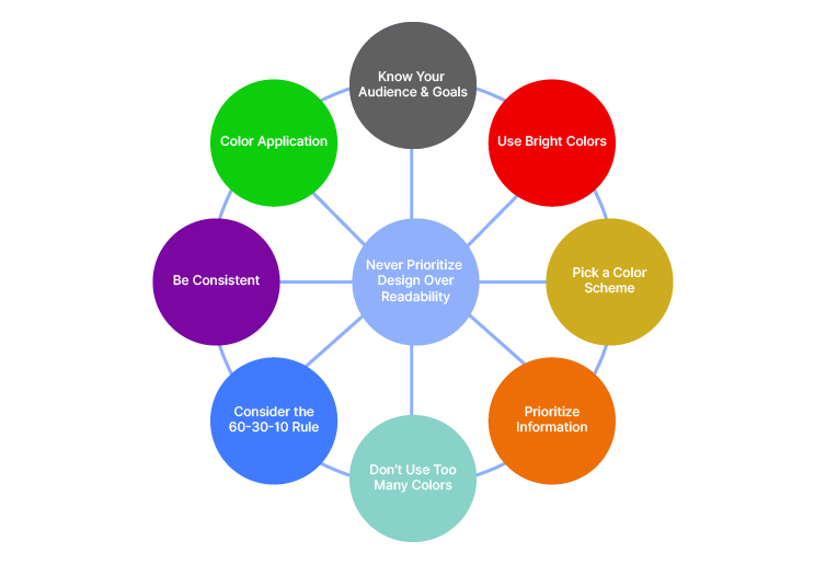
We know this might feel like a lot of information, but don’t worry – we’ve compiled our favorite tips for using color in eLearning courses to help you absorb this information:
Know Your Audience & Goals
Before you start curating content for your eLearning course, you must plan your goals. What emotions do you want to elicit? Which parts of the lesson need to be emphasized? How can you use colors to help students focus? Is your chosen color theme consistent? What can instructors do to help students with red-green color blindness in eLearning courses, and does your chosen color palette do it?
Use Bright Colors
Bright colors can stimulate the brain, which means students can learn and retain concepts more easily. This is especially helpful for visual learners. Plus, remember to consider the connotations associated with the colors you’re using so that they can attract the right attention. Also, bright colors are good, but if overused, they can lead to cognitive overload – that’s when your brain feels like mush because it’s trying to do more than it can handle.
Pick a Color Scheme
We discussed color schemes before, and we can’t stress this enough! You need to pick a dedicated color palette for your entire eLearning course. Make sure the colors go well together, but maybe also ensure a level of contrast so it’s not too dull. We recommend experimenting at this stage to see what colors look and work best for your eLearning courses.
Prioritize Information
Remember when we said you should highlight important points?
Yeah, but first, you need to identify which information is most important. Try labeling different sections of your content in order to decide what should come first, what should be written using bold lettering, what needs to stand out, etc. Also, separate main ideas from minor details to ensure a smooth flow of content.
Don’t Use Too Many Colors
Cognitive overload is a real thing, especially for students who are often dealing with several responsibilities at a time. While we recommend using loud colors, use them wisely. Don’t overdo it with too many colors. For example, try sticking to three colors or less for your eLearning courses to avoid making it too distracting or overwhelming.
Consider the 60-30-10 Rule
When we talk design, there’s a 60-30-10 rule where you usually start with a color palette of three colors – one primary, one secondary, and one accent color. You’re supposed to use these for 60%, 30%, and 10% of the content, respectively. This is a good rule of thumb when using color in eLearning courses as well.
Be Consistent
Once you’ve picked a color scheme, stick to it rather than switching up themes within the same course. This is because that would make it harder for students to concentrate on the actual content when their brains are occupied with deciphering all the colors. In fact, try to align navigational arrows and buttons with your chosen color palette so it’s easy on the eyes.
Color Application
You also need to decide how to incorporate the colors. Will you highlight words, add sticky notes, or create visuals? You could also use colored fonts, but it’s up to you to decide what works best for your eLearning course.
Never Prioritize Design Over Readability
If you’re developing an eLearning course for students, readability should always be a priority because students have short attention spans. So, while it’s important to consider using color in eLearning courses, design does not take precedence over actual content or readability. After all, that’s what really determines the value of your course – using colors itself is an attempt to improve readability.
Colors to Use in eLearning

Now that you know how to use color in eLearning courses, let’s consider what different colors represent. This will help you decide the right colors for your eLearning course:
- Red is associated with alertness and excitement, which makes it ideal for grabbing attention, but it might be disturbing for students with anxiety, so use it sparingly.
- Orange is for productivity, meaning it’s great for when you’re covering a dull subject. However, if you’re specifically targeting students with hyperactive disorders, don’t use orange.
- Blue is cool and tranquil – and it’s our favorite, too! Don’t shy away from blue because it can help students absorb complex concepts more quickly.
- Green is calming and great for maintaining focus, so it can be helpful to calm anxiety in students prepping before an exam.
- Yellow is a creative color and promotes information retention, but it can sometimes be hard to read on a white background.
- Purple is a fun color, which you can use with blue undertones to engage readers and red undertones when you want to draw attention to an important point.
- Brown is secure and friendly, but it might make things too boring or serious if overused.
Understanding these tips for using the color wheel in eLearning courses is a great first step for you to start looking into color palettes for your content.
Publish Your Content with SimpliTaught to Reach More Students!
At SimpliTaught, we’re all about helping students learn the way they learn best. We use artificial intelligence and machine learning to support their unique learning patterns. Our AI model hunts the internet for the most relevant content based on textbook concepts, and our ML model observes how students respond to the content. It then uses this information to adjust future content recommendations to deliver personalized learning experiences. Educators will also get this data to help them improve the course for the next term.
If you’re an educator who wants to reach a global student audience and make an impact, you should know about these tips for using color in eLearning courses. You can curate content and publish courses with the SimpliTaught online learning platform. And the best part? You can even monetize your content!
Contact us at info@SimpliTaught.com to learn more and start publishing your content on the best online teaching platform for teachers.